I already posted about JC Penney's virtual store on Times Square that will stay open between March 3-26. Conveniently, on Monday I was in town on some unrelated business and used the opportunity to check it out.

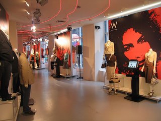
So, it's Monday early afternoon, and the location is the fairly crowded corner of 42nd st and 7th ave. The first thing that strikes you is how empty the place is: some dozen customers and at least as many attendants on all of the store's three floors.

The idea is that you go in and order whatever you want from the company's website displayed on the numerous screens throughout the store - an interesting (although expensive) way to drive traffic to a web site. The store feels eerily like those stores with automated sales people you get in Second Life (but the stuff rezzes up faster).

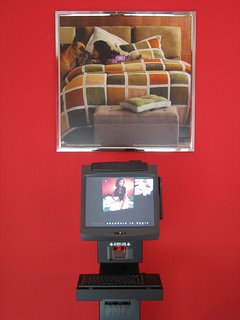
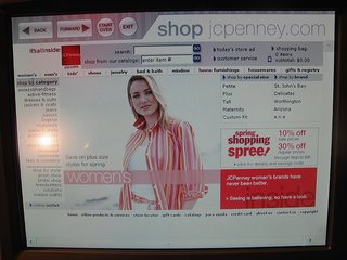
Each terminal displays the portion of the website (reworked for the occasion, the actual Web version is slightly different) relevant to the particular exhibit.

Yet the site hasn't been reworked enough. Although the terminals are equipped with a trackball and a keyboard, each display is also a touch-screen, but the distinct clickable areas are too small. Clearly designed for the mouse, they are not very finger-friendly at all.
Here're some of the things I would've done differently:
1. Larger screens. I don't think those were even 17".
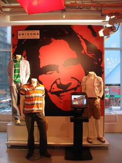
2. If you are spending that much money anyway, why settle for those huge red "deZigner" posters and not big screens or projections so that people can actually see what they are buying?
3. Closer tie-ins between displayed products and the on-screen content. The first thing one would look up is the stuff the mannequins are wearing. Use their clothes as an input device: touch the jacket and it pops up on screen along with other related stuff.
4. More and bigger pictures on the site. People don't have the convenience of their armchair, why make them squint as well?
Nice first try, though.
